Print Production
Print Production and Design
My Role: Production Design, Workflow Automation, Systems Development, Prepress
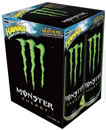
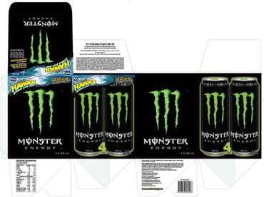
Client: Monster Energy
Assets: Cans, Multi-Packs (4 & 10-packs), Shipper Trays, Bemis Plastic Wraps, Vending Machine Graphics, In-Store Clings & Signage
Challenge: at Monster Energy required the constant development of new and updated packaging and retail marketing assets. The existing workflow for producing a comprehensive suite of materials for a single product campaign was characterized by manual processes, sluggishness, and a substantial demand on team resources. Typically, a project would involve 5 team members and take 10+ hours, creating a significant production bottleneck that hindered our market responsiveness.
In response, I conducted a thorough analysis of the end-to-end production process, identifying repetitive, time-consuming tasks. I proactively designed and implemented a novel, streamlined system that leverages intelligent templates and custom automated actions in Adobe Creative Suite. This redesigned workflow unified and automated the creation of an entire, print-ready asset package—ranging from cans and multi-packs to vending machine graphics—that previously necessitated extensive team effort.
The implementation of this new system proved transformative for the department. I reduced the time to produce a complete campaign's assets from over 10 hours to just 15 minutes for an individual operator. This substantial efficiency gain enabled the team to meet the rigorous demands of the marketing calendar, significantly increased our speed to market, and maintained impeccable brand consistency across all physical products.

Monster Energy
Product Assets
My Role: Technical Adaptation, Production Design, Prepress, Brand Collaboration
Project: Rob Dyrdek Signature Promotion
Challenge: To support a major promotion with iconic skateboarder and entrepreneur Rob Dyrdek, the artwork provided by his team needed to be perfectly adapted for various high-volume packaging formats, including promotional can graphics and multi-pack containers, while maintaining the integrity of both the Monster and Dyrdek brands.
Solution: My role was to serve as the technical design lead for the project. I meticulously adapted the artwork provided by Dyrdek's team for production, conforming the designs to precise print specifications, managing color profiles for consistency, and ensuring all branding elements were perfectly integrated for a cohesive and impactful final product.
Results: The project resulted in a successful, on-time promotional launch that powerfully leveraged Rob Dyrdek's brand to connect with a key consumer demographic. This work demonstrates my ability to handle high-profile collaborations with technical precision and a deep understanding of the print production process.
Monster Energy Australian 500mL